Article
 Article – Office luminaire examples
 Article – Stylish yet functional LED office lighting
 Article – Invest in people – Invest in office lighting
 Article – Regulations in office lighting
 DAISY article – Brilliance without the glare
LEDiL office lighting concept examples
Since offices are second homes for many of us, it is worth putting some effort into the lighting design
Artificially lit large open spaces should look natural and bright. This means ceilings and walls should be illuminated brightly and uniformly to make the space feel bigger. Regular stripes and bright light sources should be avoided, unless they are a planned effect. Balanced contrasts should also exist to make the space more visually interesting.
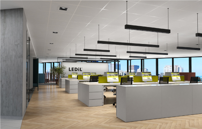
We believe the brightest spots in an office should be the monitors and windows, followed by task areas. To achieve this, it is necessarily to avoid artificially bright surfaces such as diffuser led panels, that are often too bright and dominant, causing potentially glary luminaire surfaces. The lighting concepts in this article use LEDiL optics to highlight what we believe are better alternatives to traditional forms of office lighting. These lighting concepts keep everything natural and balanced, while having some contrast to give the spaces a more interesting and dimensional atmosphere.
Task related ligthing concept
This open office concept combines both uplighting and downlighting. A batwing beam creates a uniform natural uplight on the ceiling while avoiding restless stripes. LEDiL DAISY optics provide a discreet downlight that efficiently hides the bright source from typical viewing angles. This dark light, when used with indirect light or daylight, is psychologically more harmonious and natural, reducing experienced glare and keeping luminance ratios in the room more balanced. Placing additional luminaires or wall-washers close to the wall when feasible also makes the space feel bigger and brighter. The task related lighting concept means desk areas have higher light levels and can be adjusted separately. This concept is also energy efficient as surrounding areas can be illuminated with lower light levels. The following example shows a room lit with diffuser panels which dominate the space and noticeably change the room appearance. Only using direct light results in a less bright, dull atmosphere, the so-called “cave effect”.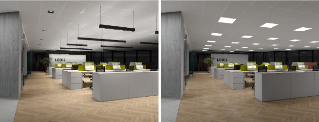
Room related ligthing concept
In the following example the whole room is uniformly illuminated using recessed luminaires. The discreet dark light design looks excellent, even though we do not generally recommend illuminating a room exclusively with direct light. This is especially true when there are enough windows to reduce the “cave effect”.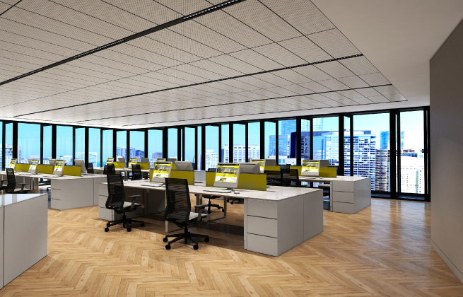
Meeting room lighting concept
In this example, we have intentionally illuminated only one wall and ceiling to make this small room bright and more appealing. Indirect light from the ceiling and walls also produces complimentary light to fill the shadows cast from the direct light pendant luminaire. Direct downlight ensures the desk is efficiently luminated.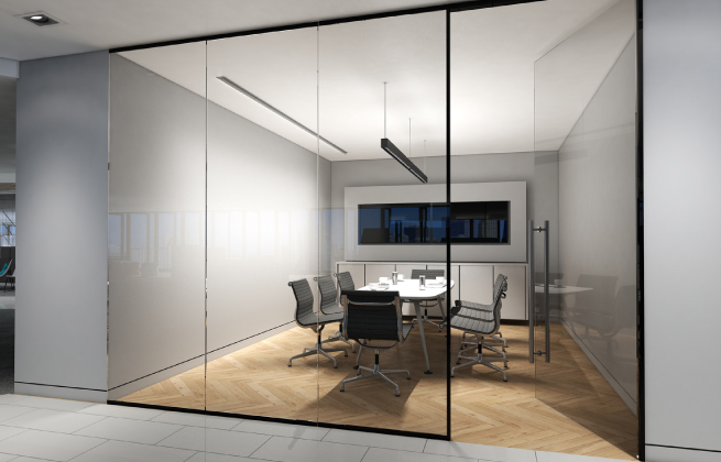
Reception area lighting concept
Here the visual hierarchy guides visitors to the reception desk where the darker ambient light with bright contrasts makes them feel welcome. First impressions matter!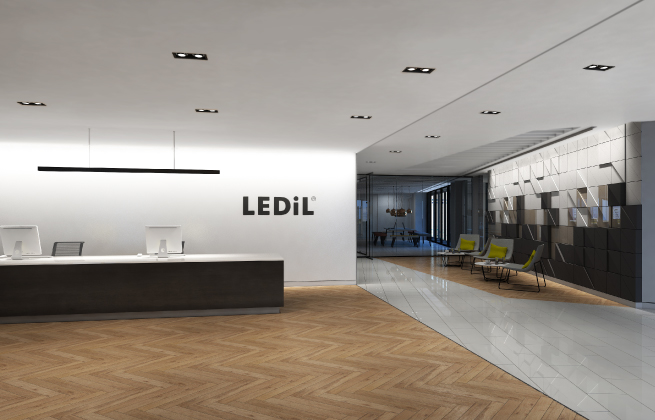


 Article – Dark light concept
  Introduction to office lighting
  Guide – Office lighting optics